Tiny Dreams
Small File Web Art & Development
Presented by Joni Schinkel with Small File Media Festival
Part of Connecting Otherwise, presented by The Hmm
Online Workshop, 2026
Small File Media Festival presents this workshop on creating small-footprint web art and folk-web projects. Information and Communication Technologies (ICT) - devices, data servers, wireless networks, and the internet broadly - account for an estimated 5% of global greenhouse gas emissions, with streaming media responsible for at least 1% of that total and likely closer to 2% given the rapid expansion of high-definition streaming, proliferation of screens, and growth of online gaming since that figure was established. The carbon footprint of devices alone is expected to exceed that of the aviation industry by 2027. This workshop responds through data-negligible ecomedia techniques, creative compression pipelines, and lo-fi media alternatives. Learn "folk web" creation methods, reclaim websites as offline or local network media, draw from permacomputing philosophies, and experiment with HTML, CSS, and JavaScript to build sustainable and accessible web content.
The Small File Media Festival was founded in 2020 to raise awareness of the high carbon footprint of streaming media. The festival proposes alternative solutions for media practice, as well as modes of thinking otherwise in media theory, which converge in an annual festival of sustainable experimental media.
Index
(1) What is Small File Media Festival and what are Small Files
(2) The communications technologies environmental dilemma
(3) Examples of small file media and forms
(4) Small files & folk web
(5) Web language basics
(6) Media formats and compression
(7) Niche and advanced techniques
(8) Local and green
(9) Accessibility
(10) What does an ideal small file site look like?
(∞) Addenda
Objectives
- Understand the environmental stakes of web bloat and why optimizing for small footprint matters.
- Learn compression and media techniques for creating efficient web art.
- Explore the folk web and permacomputing aesthetic traditions.
- Gain fluency in niche, non-googleable techniques for radical file reduction.
- Make something tiny, regardless of whether you write code or not.
(1) What is the Small File Media Festival and what are Small Files?
The Small File Media Society and our annual festival raises awareness of the carbon footprint of the internet by working with artists who experiment with media that streams at a low bitrate.
- Our organization intervenes in the rising carbon footprint of streaming media through the creation and dissemination of small-file eco-media: low-bandwidth moving image media averaging 1.44 MB/minute - the capacity of a traditional floppy disk.
- Our goal is to propose alternative solutions for media practice, not only as environmentalism, but as aesthetic form.
We...
- Teach creative methods for compression, datamoshing, and media archaeology with makers, artist-run centres, educational institutions, and community organizations across Canada.
- Host satellite workshops that have occurred in Cairo, Beirut, Kashmir, Tehran, Dhaka, Mexico City, and La Punta, Peru.
- Currently focus on expanding knowledge of low-bitrate media tactics in rural and international communities with less internet access.
Generally, a Small File...
- Does not exceed 1.44 MB/minute of duration (video; see below).
- Includes films, video, media art, HTML submissions, and executable files.
- Often yields the best results when made with obsolete technology.
Small file standards by media type
The 1.44 MB/minute standard is defined for moving image media and describes how much data a video may consume per minute of runtime. For still images, web pages, and code, duration isn't the right measure. The following are proposed working standards for small file web practice, extrapolated from the video standard and the practical limits of folk web aesthetics.
Video: 1.44 MB/minute of duration. This is the core SFMF standard. A 5-minute film should not exceed 7.2 MB. For reference, a standard YouTube 1080p stream might use 150 MB for the same 5 minutes - over 20x as much.
Still images: Under 100 KB is a reasonable target for a photographic image used on a small file site; under 30 KB is excellent; under 10 KB is considered an achievement and forces creative decisions. For comparison, the median image on the web today is around 2.1 MB - roughly 20x the small file target. At the small end: a Gameboy Camera photo (6 KB), a dithered 2-colour PNG, or a heavily compressed JPEG at low resolution are all valid small file images.
Whole web pages: Under 250 KB for the entire page including all assets. Under 100 KB is strong. Under 14 KB is the extreme target - a page that fits inside a single TCP packet and can load in one network round-trip regardless of latency. For reference, the median web page in 2025 weighs approximately 2.9 MB on desktop - more than 11 times the small file maximum.
HTML / CSS / JS code: These are text and compress very efficiently. A complete one-page site in HTML+CSS should fit in under 10 KB of source. JavaScript, if used at all, should fit in a few hundred bytes to a few kilobytes of vanilla code. If your JS payload is over 10 KB, you are likely pulling in a library or framework that has no place in a small file project.
Fonts: Ideally zero; use system fonts. If a custom font is essential, subset it to only the characters you actually use and keep it under 20 KB. A full Latin webfont from Google Fonts typically runs 150-200 KB unsubsetted.
Audio: Under 1.44 MB/minute, same as video. A 3-minute audio piece should not exceed 4.3 MB. For context, a 3-minute MP3 at standard streaming quality (128 kbps) is around 2.8 MB - already borderline. At 64 kbps mono (still intelligible for speech), that drops to 1.4 MB and meets the standard. Bytebeat formulas (see section 7) generate audio at runtime from a few dozen bytes of code - the ultimate small file audio.
The Small File Media Festival
- Founded in 2020, now in our seventh year, hosted by Vancouver's The Cinematheque.
- Celebrates media art made by hundreds of Canadian and international artists working within the small file constraint.
(2) The communications technologies environmental dilemma
Our organization and festival responds to the environmental dilemma posed by the electricity consumption of Information and Communication Technology (ICT).
Research
- ICT encompasses devices, data servers, wireless networks, video-conferencing, and the internet more broadly.
- In 2021, our founder, media and film theorist Laura Marks, worked with a team of engineers to survey 22 studies by ICT engineers and seven studies focused on streaming video specifically.
- In 2022, she worked with engineers Stephen Makonin and Kehui Li and media scholar and maker Radek Przedpełski to develop a carbon footprint calculator for ICT.
- ICT is responsible for approximately 5% of global greenhouse gas emissions, a figure rising fast with AI. (Bordage, GreenIT.fr, 2019; Cisco Annual Internet Report, 2018-2023) Of this, streaming media accounts for at least 1% and likely significantly more. (The Shift Project, Lean ICT, 2019, confirmed by Marks et al.) Laura Marks estimates this figure has expanded considerably since 2019, with the proliferation of high-definition streaming, more screens globally, and the growth of online gaming. The carbon footprint of devices alone is expected to exceed that of the aviation industry by 2027. (Pirson and Bol, Journal of Cleaner Production, 2021)
- Disagreement among researchers largely centres on the system boundary question: should device manufacturing, metal mining, disposal, and data centre infrastructure all be included in the count?
Perspective
- We understand our project as both a movement and a tactical method in art.
- We contextualize our work as a fine art medium, celebrating the small file for its aesthetic properties as well as its environmental implications.
- Small file movies don't share in the seamless luxury of their large-file counterparts. They glitch, break, bloom, and artifact.
- Small-file cinema constitutes a radical new aesthetic practice born of environmental necessity and formal experimentation.
Getting Started: Small File Basics for Video
- Begin by filming at lower resolution.
- Prioritize shape, colour, and movement over content to ensure a visually satisfying image at high compression.
- Record sound in mono.
- Decrease camera movement and movement within the frame.
- Use a shallow focal depth.
- Experiment with compression parameters in tools like Handbrake and Any Video Converter. Depending on the settings, figures can develop dramatic outlines or blur together into abstract patterns.
Examples
(3) Examples of small file media and forms
In January 2023, inspired by the Small File Media Festival, The Photographers' Gallery in London launched the Small File Photo Festival.
- The first image on the web appeared in 1992. It was approximately 12 kilobytes.
- The average size of an image on the internet today is around 2,100 kilobytes (2.1 MB), a 175x increase.
- 80% of web traffic consists of visual material, contributing significantly to the internet's 4% share of global greenhouse gas emissions.
A 2021 study found that unwanted pictures lingering in the cloud across most people's devices release about 355,000 tonnes of CO2 per year, equivalent to roughly 112,500 round-trip flights from London to Perth, Australia. (IET, Dirty Data, 2021) Common culprits include:
- Failing to delete duplicate pictures from phones (69% of respondents).
- Using two or more devices simultaneously (nearly 60%).
- Passive streaming: focusing on another device while video plays (52%).
- Failing to clear messaging archives, e.g. WhatsApp, Facebook Messenger (63%).
- Holding onto old text messages (56%).
Camera manufacturers, IT companies, and streaming platforms push relentlessly for higher resolutions to market new products. Smaller images offer wider accessibility, lower footprint, and a diverse range of aesthetic possibilities.
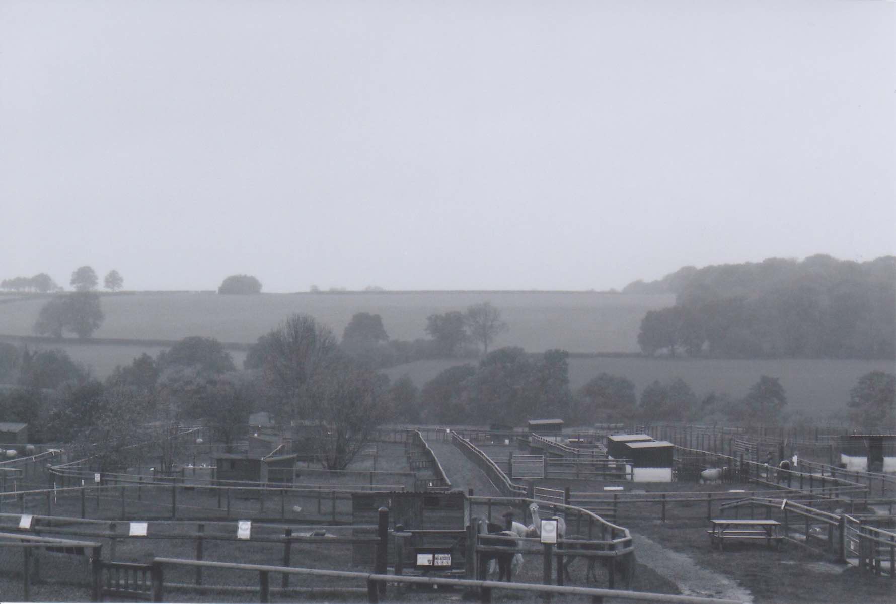
Artist: Tanya Boyarkina
Title: Hoar Park Farm 2020
Category: Show Me The Pixels
File size: 97kb
Description: I enjoy 35mm photography in my free/off-screen time, but the process of digitising the photographs once they have been developed also leads to interesting meditations on the qualities of pixelation and compression. Using default system applications, photographs are scanned, cropped, zoomed in and screenshotted, exported, and finally, two results from the same scan are paired together when I find a playful outcome. Shot at Hoar Park Farm (Warwickshire) using 35mm found black and white film on Pentax MX.
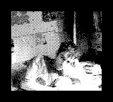
Artist: Sophie Sherwood
Title: I <3 Andy
Category: Small Is Beautiful
File size: 6kb
Description: After searching through my old teen bedroom in 2018 I found my Gameboy Camera and looked through the photos. My Dad, Andy Roberts, passed away in 2005 after a hit and run on Bethnal Green road. I was completely floored to find this tiny photo of him lounging in the very bedroom I'd found it.
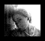
Artist: Sophie Sherwood
Title: Self Portrait as a Teen
Category: Small Is Beautiful
File size: 7kb
Description: Taken on a Gameboy Camera. I believe this was taken on a school trip, perhaps to Dartmoor, and I was probably listening to The Man Who by Travis.

Artist: Lauren Mason
Title: Thumbnails of Thumbnails 2 / Images sourced from Facebook Marketplace
Category: Dress To Compress
File size: 65kb
Description: Each of these image submissions are part of my wider ongoing project 'Thumbnails of Thumbnails', which started in 2022. These images have been considerably cropped and compressed in Adobe Photoshop. The images of thumbnails are located during searches in Facebook Marketplace for items you might expect to be held by thumbs - rings and thimbles prove most popular, or the odd Kalimba.
(4) Small files & folk web
The concept of small-footprint web design has deep roots: early web pages in the 1990s were naturally lightweight due to technological limitations. As technology advanced, web pages became dramatically more complex and resource-intensive. According to the HTTP Archive, the median web page has ballooned from around 467kb in 2010 to over 2,669kb today - more than 5x growth in a decade and a half, with no sign of stopping.
Standards for file reduction and debloating do exist, but these efforts are generally concerned with load times and efficiency, and don't go nearly far enough to curb meaningful ecological damage through server usage and data access. Following the eco-conscious philosophies of Small Files and adapting permacomputing tenets, small file websites attempt a new way to design and develop frontend experiences: web art specifically conceived as an ecological and aesthetic practice.
Small footprint web art uses minimal resources in terms of bandwidth, storage, and processing power. This means optimized file sizes, efficient coding practices, and streamlined design, but most importantly, a willingness to forego many of the "advances" that emphasize comfort over efficiency: external libraries, cookies, webhooks, global CDN access, high-definition media, legible images, non-system fonts, or reliable access altogether (e.g. solar-powered or local-network-only projects).
How big is the web, actually?
It helps to have concrete reference points. These ballparks are based on typical page loads using browser developer tools and the HTTP Archive; exact figures vary by device, location, and what the page loads dynamically.
The median web page (2025): approximately 2.9 MB on desktop, 2.6 MB on mobile. This is the average of everything, from minimalist blogs to bloated e-commerce. The 90th percentile exceeds 10 MB. The median page has grown 200% since 2015, with no sign of reversing. (HTTP Archive, Page Weight Report)
Breakdown of a typical median page by resource type:
- Images: ~1 MB (the largest single category by weight)
- JavaScript: ~600-700 KB (the largest by request count; a median page loads 24 separate JS files)
- Fonts: ~130-140 KB
- CSS: ~80 KB
- HTML: ~20 KB
- Video (when present): grows rapidly; the 90th percentile page ships nearly 5 MB of video
The JavaScript figure is particularly striking in the context of this workshop. The median JS payload alone (around 600 KB) is more than double the small file maximum for an entire page. And that's before the page has loaded a single image.
Sites people assume are lightweight:
Wikipedia: Actually one of the leaner major sites - a typical article page runs around 300-500 KB transferred, mostly content; Wikipedia does not run JavaScript frameworks, uses minimal external dependencies, and loads images lazily, scoring well on carbon calculators. A genuine exception to the rule, and worth holding up as a model.
Substack newsletters: A Substack post page typically loads 1-3 MB, despite appearing to be a simple text article. The weight comes from tracking scripts, social sharing widgets, subscription pop-up code, and fonts, none of which contribute to the reading experience. The text of the article itself is usually under 20 KB.
Notion pages: A shared Notion page is usually 3-5 MB+ even for a short document. Notion is a full React application loaded on every page view; the framework overhead arrives regardless of how much content is on the page. A Notion doc may be lightweight to read, but not to transfer.
Squarespace / Wix / Webflow portfolio sites: These typically land between 3-8 MB. Drag-and-drop website builders generate substantial CSS overhead (often 100-200 KB of CSS for a page that only uses 5% of it), load multiple analytics and marketing libraries by default, and inline every style twice. A site built on Squarespace has an inherent baseline weight that can't be removed without leaving the platform.
Linktree and similar link-in-bio pages: Typically 1-3 MB for a page containing only a handful of links and a profile photo. These are often React or Next.js applications - the framework overhead is fixed regardless of content. A hand-coded equivalent in HTML would be under 5 KB.
A note on "eco-friendly" website claims: Several website builders advertise environmental credentials while producing multi-megabyte pages. The green claim usually refers to the hosting infrastructure (renewable energy certificates) rather than the efficiency of the pages themselves. A page that transfers 5 MB per visit on green-certified servers still transfers 5 MB per visit. Infrastructure choices and page weight are separate variables, and both matter.
Framework overhead as a baseline cost:
Choosing a JavaScript framework is a decision about a minimum weight you'll pay on every page, regardless of content. These are approximate gzipped baseline sizes for a "hello world" app in each framework:
- Vanilla HTML/CSS/JS: 0 KB overhead; you only pay for what you write
- Vue 3: ~33 KB gzipped baseline
- React 18 + ReactDOM: ~42 KB gzipped baseline
- A minimal Next.js page: 70-100 KB before any content
- A minimal Gatsby page: similar to Next.js, plus GraphQL runtime
- Angular: ~100 KB+ gzipped baseline
These numbers are for bare "hello world" apps. Real-world apps add routing libraries, state management, UI component libraries, and utility packages. A modest React app with a router, a UI kit, and a few utilities commonly ships 300-500 KB of JavaScript before a single line of application code. For a small file art project, any of these frameworks is disqualifying from the start.
Benefits of small file websites
Accessibility: Small file sizes mean faster load times, which is crucial for users with slow internet connections, limited data plans, or older devices. This broadens who can access and enjoy the work.
Performance: Optimized web pages load faster, reducing bounce rates and improving engagement.
Sustainability: Reducing data transferred and stored lowers energy consumption in data centres, directly reducing the carbon footprint of web hosting.
Longevity: Simple, static HTML with no dependencies is more archivable. A file that worked in 1997 Netscape often still works today. The same is not true for a React app from 2019.
Examples
These are real, linkable sites - ranging from a few hundred bytes to a few kilobytes. Most are intentionally minimal, a few are incidentally tiny because they were made before bloat was the default.
Internet art
- Rafaël Rozendaal - Internet Works: the full catalogue of Rozendaal's website artworks. Each is a domain name pointing to a single-page interaction: gradients, jello, falling objects, colour fields. All tiny. All sold to collectors while staying publicly accessible. Start here, then explore the individual domains.
- My Boyfriend Came Back from the War (Olia Lialina, 1996) - one of the foundational works of net art. A nonlinear narrative told through nested browser frames and grainy GIFs, hand-written in HTML. Made before web frameworks existed. The entire story is maybe 20KB including all assets.
- art.teleportacia.org (Olia Lialina) - her complete site, which is itself a folk web artefact. The homepage is a portal built in early HTML conventions; follow the links to see works spanning from 1996 to present.
- Rhizome Net Art Anthology: a curated archive of historically significant net art, many pieces from the 1990s-2000s. Useful both as a reference and as a browser of the kind of work that can be made in kilobytes.
- petracortright.com (Petra Cortright) - a deliberately lo-fi personal site with embedded videos and dense layered image chaos. Chaotic folk-web energy from an established artist.
- endless.horse: an infinitely scrolling horse made of ASCII characters. HTML only, ~4KB. The horse never ends.
Functional minimal sites
- Motherfucking Website: a polemic against web bloat written as a web page. Plain HTML, no CSS, no JS, ~4 KB. Makes its argument by being the argument. It spawned a chain of responses, each adding slightly more while arguing about where the line is: Better Motherfucking Website (adds readable line length and a bit of CSS), Even Better Motherfucking Website (adds a monospace font and more opinions), and The Best Motherfucking Website (adds satire of the previous entries). The chain is itself an argument about standards, taste, and when "better" stops being better.
- wttr.in: a full weather service delivered as plain text. No images, no JavaScript, ~11KB. 11 times smaller than weather.com at ~6.8MB.
- Wiby.me: a search engine for the small web, indexing only lightweight, non-commercial, hobby sites. About 9KB. Has a "surprise me" button that sends you to a random tiny site from its index.
- CNN Lite: the full CNN news service as a text-only page. A useful reminder that almost all web content could be delivered this way.
- NPR Text: same. All the news, no images, no scripts, loads anywhere.
- This is a web page (Justin Jackson) - an essay about how a web page is just words on a screen, demonstrating that point by being only words on a screen. ~4KB.
Extreme and experimental
- 1KB Club: a directory of websites under 1,024 bytes. Some good ones from the list: cenzontle.us (252 bytes - a single poem), halleyhares.ltd (941 bytes), hen.re (1009 bytes - a minimal personal page). Browse the full list for more.
- 10KB Club - websites under 10KB that are genuinely useful and content-rich. Members include suckless.org (software minimalism philosophy), danluu.com (long technical essays, no CSS), and sqlite.org (documentation for one of the world's most used databases, under 10KB per page).
- 512KB Club: a larger community of sites under 512KB, with browsable member list and discussion about what it takes to stay small while being genuinely useful.
- guimp.com: an 18x18 pixel website containing a full game of Pong, Pac-Man, and Space Invaders. Everything runs in an 18-pixel square.
Community and discovery
- Wiby "Surprise Me": a random small-web site from Wiby's index. One of the best ways to feel what the early internet felt like.
- Neocities browse: thousands of hand-built personal sites. Filter by tag. Pure folk web.
- The Tiny Awards: an annual celebration of small, creative, hand-made sites and web projects. Past winners are a reliable source of examples.
Folk web and the small web
The "folk web" refers to a DIY approach to web development emphasizing simplicity, creativity, and accessibility. It often uses basic web technologies in innovative ways, without heavy frameworks or extensive libraries - and frequently leans on tools considered outmoded by mainstream web culture.
The folk web movement values content and functionality over aesthetic complexity. Folk web projects tend to reflect the visual aesthetics of early internet design - what may initially read as lowbrow, amateurish, or sloppy alongside highly compressed media. These are the aesthetics of ecomedia on the web, representing a design philosophy that favours near-zero carbon output and rejects wasteful, inefficient, superfluous technologies.
Small file websites should be no larger than 250KB. But with a principled design philosophy, spectacular and useful web projects can reach 15KB or lower.
(5) Web language basics
HTML and CSS
HTML: HyperText Markup Language (HTML) is the standard markup language for web pages. "Semantic HTML" uses tags that describe their meaning in a human-readable way - <article>, <section>, <nav> - improving accessibility, readability, and long-term parsability.
<!DOCTYPE html> <html> <head> <title>This is the document title</title> </head> <body> <h1>This is a heading</h1> <p>Document content goes here.</p> </body> </html>
CSS: Cascading Style Sheets control the presentation of web pages. Inline CSS, placed inside a <style></style> block in the HTML file, is ideal for small file projects where an external stylesheet would add a separate network request. Every HTTP request has overhead and for truly tiny sites, reducing the number of fetched files matters.
<style> .small-image { width: 100px; height: 100px; } </style>
JavaScript and JSON
JavaScript enables dynamic and interactive content. It can modify HTML and CSS after the page loads - interactions, animations, formatting not possible with HTML alone. For small file work, use vanilla JavaScript only. No jQuery. No libraries loaded from a CDN. Every external script is a dependency and a network round-trip.
<script> document.getElementById('content').innerHTML = 'Updated Content'; </script>
JSON (JavaScript Object Notation) is a lightweight data interchange format. In small file web work, a compact JSON file can contain all the dynamic content for a page, loaded once and parsed locally - far smaller than fetching data from an API.
Markdown: Markdown is a lightweight markup language - often used for readme files and forum posts. Keeping source documents in plain text ensures they're lightweight, universally accessible, and editable on virtually any device.
Static sites
A static website consists of pre-built HTML, CSS, and JavaScript files - "client-side" languages that execute in the browser. The server just hands the file to the visitor; no database query, no server-side rendering, no spinning up a process. In the context of small file web art, static sites are the standard: smaller, faster, more reliable, more energy-efficient, and able to be hosted anywhere - including locally. Static sites are also more archivable, more secure, and lower in hosting cost.
There is no shame in using visual design platforms that export to legible HTML/CSS/JS - Figma plugins, Webflow - but check the output carefully. These tools often produce bloated code, inline every style twice, and add dozens of unused classes. Treat generated code as a starting point to be aggressively pruned.
(6) Media formats and compression
Image formats
JPEG: Lossy format that can reduce file size significantly while maintaining reasonable image quality. Can be pushed very aggressively to generate extremely small files; the artifacts are frequently beautiful. Great for photographs and complex colour gradients; poor for text, sharp edges, or large uniform areas.
PNG: Lossless format with transparent background support. File sizes are generally larger than JPEG, especially for complex images. Ideal for graphics, text, and anything requiring transparency - but not ideal for strict small file projects unless transparency is essential.
GIF: Limited to 256 colours, which is actually a feature: drastically reducing the colour palette creates striking visual effects while lowering file size. Can contain simple animations. The 256-colour ceiling is a constraint that rewards creative decisions.
WebP: A modern format designed for web, WebP provides better compression than JPEG and PNG, supports transparency (like PNG) and animation (like GIF), and can contain compressed video. Support is now broad across modern browsers, a solid default choice when you control the environment.
AVIF: Even newer than WebP. AVIF (AV1 Image File Format) offers dramatically better compression - files that are 50% smaller than equivalent JPEG at comparable quality. It also supports HDR, wide colour gamut, and alpha channel. Browser support is strong in 2025, though older browsers may need a JPEG fallback. Use with the <picture> element (see Niche Techniques, section 7).
Image compression methods
GIMP / Photoshop: Image editing software allows specific adjustments to compression settings. GIMP is an evergreen, cross-platform, free and open-source alternative to Photoshop, available for Windows, macOS, and Linux. ImageMagick offers scriptable, batch image processing from the command line.
MS Paint: Simple, zero-install, available on most Windows machines. Limited compression control, but useful in a pinch. Pinta is a Linux equivalent; jspaint.app is an in-browser analogue.
Word processor compression: A genuine hack. Insert images into a Word document, select the image, click "Compress Pictures" in the Format tab, choose your target resolution, and save. Works offline on systems with no dedicated compression tools, and available almost everywhere.
Dithering: Often overlooked as a serious compression technique. Dithering converts a full-colour image to a limited palette (often just 2–16 colours) while using pixel patterns to simulate in-between tones. The result is a dramatically smaller file (since fewer unique colours require less data to encode), plus a distinctive, retro-printed aesthetic. Tools like Dither It! or ImageMagick's -dither FloydSteinberg flag make this accessible without coding knowledge.
Datamoshing: Manipulating media file data to achieve visual effects. Basic experimental datamoshing can be done by opening an image file in a text editor and editing the underlying text, or in an audio editor like Audacity. The full breadth of techniques can be found at datamoshing.com and in online communities.
Command line compression (batch):
convert input.png -resize 800x600 -quality 85 output.jpg ffmpeg -i input.mp4 -vf scale=640:360 -b:v 500k output.mp4
Hex editing: Similar to datamoshing. Editing image data directly in a hex editor allows manual adjustment and experimentation at the byte level. Requires knowledge of file structures. ImHex is a good modern hex editor.
Online tools: TinyPNG, CompressJpeg, Squoosh (by Google, notably excellent). Accessible from any device, but involve uploading your files to a remote server - consider privacy and energy implications.
Alternatives to raster images
CSS art: Creating visuals using only CSS - shapes, gradients, and composition built from code. Eliminates image files entirely. The floppy disk below is rendered entirely in CSS.
SVG: Vector graphics coded as mathematical points, lines, curves, and shapes. SVGs are infinitely scalable and lossless - a few dozen lines of code may replace a 200kb image file. Can be created in Inkscape (free, open-source) or written by hand in HTML. The simpler the shape, the smaller the file. Every additional node adds bytes.

ASCII art: Completely text-based illustrations with negligible file sizes. A nostalgic artform with a unique aesthetic. Must be formatted carefully to survive HTML rendering - use a <pre> tag or preserve whitespace with CSS.
 _______________
 |[]            |
 |  __________  |
 |  | SMALL  |  |
 |  | FILE   |  |
 |  |________|  |
 |   ________   |
 |   [ [ ]  ]   |
 \_[_[_]__]_____|
Pixel art: Low-resolution images using a limited colour palette - harkening back to early video game graphics. Pixel art can be saved at very low resolution as lossless files and retain full aesthetic quality. This can also be emulated using rows of CSS-styled <div> elements. Common tools: Piskel (browser-based, free) and Aseprite (paid).

Video formats
MP4 (H.264/H.265): The most universally compatible format. H.264 offers an excellent quality-to-compression ratio; H.265 (HEVC) offers roughly 2× the compression of H.264 at equivalent quality, at the cost of encoding time and slightly lower device support.
WebM (VP9/AV1): Open, royalty-free formats designed for web. VP9 is comparable to H.265; AV1 is the current state of the art, offering better compression than any of the above - though encoding is slow. WebM is well-supported in modern browsers and is an excellent small file alternative to MP4 for web embeds.
MKV: Royalty-free container supporting multiple video, audio, and subtitle tracks. Better suited for desktop playback than web embedding.
AVI: A legacy format. Files are generally large and inefficiently compressed. Useful for raw footage and editing, but not for online embeds.
MOV: High quality but almost always enormous. Apple-originated, with potential compatibility issues on non-macOS platforms. Use as an editing source, not a distribution format.
Video compression parameters
Bitrate: Amount of data processed per unit of time. Lowering the bitrate reduces file size - and creates distinctive artifacts that are often aesthetically interesting in small file work.
Resolution: A small file video is unlikely to exceed 720p; ideally much smaller. Going to 480p or below changes the look significantly.
Frame rate: Reducing frames per second cuts data significantly. 24fps is cinematic; 15fps starts to feel strange and dreamy; 8fps or below becomes visibly fragmented.
Codec choice: H.264 is the safest; H.265 or AV1 for maximum compression.
Two-pass encoding: Encodes twice - the first pass analyses the source, the second compresses based on that analysis. Results in better quality at lower bitrates, especially for variable content.
HandBrake: Free, open-source, cross-platform. Excellent codec support. The most common tool for small file video compression, and the easiest to start with.
VLC Media Player: Free, open-source, cross-platform. Designed for playback but includes format conversion and basic compression. Supports even obscure file formats.
General page-level reduction techniques
Lazy loading: Adding loading="lazy" to any <img> tag means images only load when the user scrolls them into view. Zero JavaScript required; it's a native HTML attribute.
Click-to-load media: A few lines of JavaScript can replace any image or video with a text label that loads the media only when clicked, letting the user choose what they fetch.
Asset reuse: The same file only needs to be transferred once. Reference the same file path repeatedly; the browser caches it after the first load.
Code culling: Remove every unused style, every commented-out block, every line that doesn't serve a function. No external JavaScript libraries. No CDN-loaded frameworks. If vanilla JS can do it, use vanilla JS.
Inline CSS and JS: Every external file is a separate HTTP request - the browser has to ask the server for each one. For a small site, put your CSS inside a <style> block in the <head> and your JavaScript inside a <script> block at the bottom of the <body>, rather than linking to separate .css and .js files. One file, one request, nothing left on the table. The tradeoff is that inline styles can't be cached separately - but for a single-page small file site, that's rarely a concern worth worrying about.
<!-- Instead of this: --> <link rel="stylesheet" href="style.css"> <!-- 1 extra request --> <script src="app.js"></script> <!-- 1 extra request --> <!-- Do this: --> <style> body { ... } </style> <!-- 0 extra requests --> <script> // your code </script> <!-- 0 extra requests -->
Minification: HTML, CSS, and JavaScript can be stripped of whitespace, comments, long variable names, and redundant syntax, often reducing file size by 30-70% with no change in behaviour. This is the last step before publishing; work in readable code, minify for distribution.
Online tools (no install required):
- minify-js.com - JavaScript minifier
- Toptal CSS Minifier - CSS
- Toptal HTML Minifier - HTML
- Terser Online - advanced JS minifier, also supports RegPack and deflate output for extreme compression
In code editors: VS Code has the Minify extension (HookyQR) which adds a right-click "Minify" option to any open file. Sublime Text has the Minify package via Package Control. Both produce a new .min.js or .min.css file alongside the original. If you're already using a static site generator like Eleventy, most have built-in minification plugins.
For JavaScript specifically, minification is distinct from compression. Minification removes whitespace and renames variables in the source. Compression (gzip/brotli) happens at the server/transfer level. Both help; they stack.
System fonts: Avoid loading web fonts entirely. Specifying font-family: monospace or font-family: serif uses whatever the visitor's OS already has - zero network request, zero bytes transferred, and a font that already renders crisply on their screen.
(7) Niche and advanced techniques
This section is where the workshop gets into territory you're unlikely to find by googling "how to make a small website." It covers a range of approaches - some practical, some conceptual, some borrowed from communities who have been doing extreme size-reduction as an art form for decades.
The demoscene and size coding: where this thinking comes from
Before permacomputing was a concept, the demoscene was already doing this. The demoscene is an international computer art subculture dedicated to making self-contained audiovisual programs - demos - that run from a single executable file with no assets. Competitions are structured by strict size limits: 64k intros (65,536 bytes), 4k intros (4,096 bytes), 1k intros (1,024 bytes), and smaller. A winning 4k intro might contain minutes of real-time 3D animation with procedurally generated music, produced entirely from 4,096 bytes of machine code - no images, no audio files, everything synthesized from math at runtime.
Viznut (Ville-Matias Heikkilä), the Finnish artist-programmer who coined the term "permacomputing," came directly from this world. His 2020 permacomputing text explicitly draws on demoscene values: maximizing hardware lifespan, treating constraints as generative rather than limiting, rejecting the assumption that more resources always produce better results. This lineage matters. Permacomputing isn't an academic concept that migrated into creative tech - it emerged from decades of people doing the most with the least, for the love of it.
The size-coding wiki at sizecoding.org documents the specific techniques used in demoscene productions. Much of it is assembly-level and deeply platform-specific, but the browser-oriented techniques in particular are directly applicable to small file web work.
Bytebeat: music from a single mathematical expression
Also originated by Viznut, bytebeat is algorithmic music generated from a single mathematical expression. The expression takes a time variable t (incrementing 8,000 times per second), applies bitwise operations and arithmetic, and outputs a raw audio byte. The result is looping, rhythmic, chiptune-adjacent music - generated at runtime from sometimes fewer than 30 characters of code.
t*(t>>5|t>>8) /* viznut's first bytebeat - a chord arpeggio */ (t>>7|t*5)&(t>>4|t*3) /* something more complex */
Why does this matter for small file web? Because a bytebeat expression is essentially a zero-byte audio file. The "recording" is the formula itself - maybe 20 bytes. The browser's Web Audio API can generate and play the output in real time. No audio file is downloaded at all.
Try formulas at dollchan.net/bytebeat - paste a formula, press play. The site also has an archive of community-discovered formulas. This is also a good no-code entry point for participants to experiment: try changing a single number in a working formula and hear what happens.
A working bytebeat player in HTML/JS:
<script> const ctx = new AudioContext(); const buf = ctx.createBuffer(1, ctx.sampleRate * 4, ctx.sampleRate); const d = buf.getChannelData(0); for (let t=0; t<d.length; t++) d[t] = ((t*(t>>5|t>>8))&255)/128-1; const src = ctx.createBufferSource(); src.buffer = buf; src.loop = true; src.connect(ctx.destination); src.start(); </script>
The entire audio engine - for looping generative music - is about 250 bytes.
PNG bootstrapping: polyglot files and compression exploitation
This is one of the demoscene's most elegant technical tricks, and it works in the browser. The core insight is that PNG files use DEFLATE compression internally (the same algorithm as gzip/zip). If you encode your JavaScript source code as the pixel data of a PNG image, the PNG format compresses it extremely efficiently - often better than any JS minifier alone. A tiny bootstrap HTML wrapper (~160 bytes) then loads the PNG, reads its pixel values back as ASCII codes, reconstructs the original code string, and evaluates it.
The result is a single file that is simultaneously a valid HTML page and a valid PNG image, a polyglot. Open it in a browser and it runs as a web page. Rename it to .png and open it in an image viewer and it displays as an image (which just happens to look like noise). The compression ratio is significantly better than gzip alone because the PNG format's DEFLATE settings are optimized for image data.
<!-- The ~160-byte PNG bootstrap wrapper --> <canvas id=c><img onload=b=c.getContext('2d');S=String.fromCharCode; for(i=e='';t=b.getImageData(0,0,1,!b.drawImage(this,i--,0)).data[0];) e+=S(t);(1,eval)(e) src=#>
Tools like PNGinator automate the process: give it your minified JS, get back a single PNG-HTML polyglot file. This technique is overkill for most small file web projects, but it represents the logical extreme: a working web experience in a file smaller than most favicons.
A related but more accessible technique is the HTML/ZIP polyglot - a single file that is both a self-contained web page and a valid ZIP archive, with all assets embedded inside the ZIP comment. This is how some indie game devs distribute entire browser games as a single `.html` file with no external dependencies.
The CSS checkbox hack and radio state machine
CSS has no "variables" in the programming sense, but it does have state: the checked/unchecked state of form inputs. Surprisingly complex interactive behaviour is possible with zero JavaScript.
The checkbox hack uses a hidden <input type="checkbox"> and the CSS :checked pseudo-class plus the sibling selector to toggle arbitrary elements when a label is clicked:
<input type="checkbox" id="toggle" hidden> <label for="toggle">Open menu</label> <nav>...menu content...</nav> <style> nav { display: none; } #toggle:checked ~ nav { display: block; } </style>
This works because the label click toggles the checkbox's checked state, and CSS can respond to that state through the sibling combinator (~). No JavaScript event listener. No DOM manipulation. The browser's form state management handles everything.
The radio state machine extends this: by using a group of radio buttons (only one can be checked at a time), you can create multi-state interfaces - tab systems, carousels, multi-step forms, even simple games - entirely in CSS. Each radio button represents a named state; CSS rules respond to which one is checked. A full functioning tab interface in CSS and HTML, with no JavaScript at all, runs to maybe 30 lines of code.
See a minimal tab example
<input type="radio" name="tab" id="t1" checked hidden> <input type="radio" name="tab" id="t2" hidden> <label for="t1">Tab 1</label> <label for="t2">Tab 2</label> <div class="panel p1">Content A</div> <div class="panel p2">Content B</div> <style> .panel { display: none; } #t1:checked ~ .p1 { display: block; } #t2:checked ~ .p2 { display: block; } </style>
Full tab switching, no JavaScript. The same principle scales to accordions, lightboxes, slideshows, theme toggles, and navigation systems.
Data URIs and the truly self-contained single file
A data: URI embeds a file directly into HTML as Base64-encoded text. Your entire site - HTML, CSS, images - can live in one file with zero external dependencies:
<img src="data:image/png;base64,iVBORw0KGgo...">
A 214-byte PNG becomes a ~290-character string inline in your markup. The whole thing saves to disk, travels by email, runs from a USB drive or a solar-powered Pi with no folder of assets needed alongside it. The trade-off: Base64 encoding adds ~33% to file size, and browsers can't cache embedded assets separately. For small files, this cost is usually worth it.
In CSS, store a data URI as a custom property and reference it multiple times - the image is only defined once:
:root { --icon: url("data:image/svg+xml,..."); } .icon { background: var(--icon); }
You can also embed an entire CSS stylesheet as a data URI in a <link> tag, or embed a JavaScript file similarly - though at that point you're approaching PNG bootstrap territory.
The <picture> element: format negotiation
Rather than serving one image format to everyone, <picture> lets the browser pick the best format it supports. List AVIF first (smallest, modern), WebP second, JPEG last (universal fallback):
<picture> <source srcset="image.avif" type="image/avif"> <source srcset="image.webp" type="image/webp"> <img src="image.jpg" alt="description" loading="lazy"> </picture>
AVIF can be 50% smaller than equivalent-quality JPEG. Visitors on modern browsers get AVIF; older browsers fall through to JPEG. Nobody gets a format their browser can't render.
<details> and <summary>: zero-JS accordions
Native HTML has a built-in disclosure widget that opens and closes with no JavaScript. The browser handles the toggle behaviour entirely:
<details> <summary>Click to expand</summary> Hidden content here. </details>
Live example (no JavaScript used)
This opened and closed using only the browser's native HTML parsing. No JavaScript, no event listeners, no libraries. CSS can target details[open] to style the open state, and add a transition to animate the reveal.
Use this for FAQs, expanded examples, image galleries, navigation menus, code samples - anywhere you'd otherwise reach for a JavaScript toggle. Combined with the radio state machine above, you can build surprisingly full-featured interfaces in pure HTML/CSS.
Dithering as both compression and aesthetic
Dithering converts a full-colour image to a tiny palette (2–16 colours) while using dot patterns to simulate tonal gradation. The result looks like a 1-bit risograph print or an old newspaper photograph - and is dramatically smaller than the original. A colour photograph saved as a 2-colour dithered PNG can be an order of magnitude smaller.
Low Tech Magazine runs their entire website using dithered images - a principled decision that makes the compression visible and the aesthetic consistent. Their solar-powered server goes offline when the battery depletes; the site's visual language makes that constraint legible rather than hiding it.
Dither It! is a browser-based tool - upload an image, choose an algorithm (Floyd-Steinberg, Bayer, random), pick a palette, download. No coding required. Compare file sizes before and after.
Subsetting fonts - or abandoning them
A full webfont for a Latin character set might be 150–200kb. If your page only uses printable ASCII, a subsetting tool like fonttools/pyftsubset strips unused glyphs and brings that under 20kb. Add font-display: swap to your @font-face so text shows immediately in the fallback font while the custom one loads, rather than going blank.
Better: use no font at all. Specify font-family: monospace or font-family: serif and the visitor's OS supplies whatever it has. Zero transfer, zero latency, renders crisply on their hardware. And it looks different on every machine - every visitor sees a slightly different version of the site, shaped by their system. This is a feature of folk web aesthetics, not a liability.
Responsive images with srcset
Serve the right image size to the right screen. A desktop retina display needs a 1200px image; a phone with a 320px screen doesn't. srcset lets the browser decide:
<img srcset="img-400.jpg 400w, img-800.jpg 800w, img-1200.jpg 1200w" sizes="(max-width: 600px) 400px, 800px" src="img-800.jpg" alt="..." >
Nobody downloads more than they need. Combined with AVIF via <picture>, this is one of the highest-impact combinations for reducing image transfer weight.
Service Workers for offline-first sites
A Service Worker is a tiny background script that intercepts network requests. After a first load, it can cache your entire site locally - subsequent visits work completely offline. A site visited once at a café then runs forever without internet. This is how folk web projects can serve remote or low-connectivity communities: distribute the URL, and once someone has loaded it, it's theirs.
// sw.js self.addEventListener('install', e => { e.waitUntil(caches.open('v1').then(c => c.addAll(['/', '/index.html', '/css/tiny.css']) )); }); self.addEventListener('fetch', e => { e.respondWith(caches.match(e.request).then(r => r || fetch(e.request))); });
<script> if ('serviceWorker' in navigator) navigator.serviceWorker.register('/sw.js'); </script>
content-visibility: auto
A CSS property that tells the browser to skip rendering off-screen content until the user scrolls to it. For long pages, this dramatically reduces the work done on initial load - the browser renders only what's visible:
.section { content-visibility: auto; contain-intrinsic-size: 0 500px; /* rough height hint */ }
No JavaScript. The page looks identical. The rendering engine just defers work it doesn't need to do yet - which is both faster and lower energy.
Frugal, salvage, and collapse computing (100 Rabbits / Devine Lu Linvega)
The design collective 100 Rabbits - Rek and Devine Lu Linvega, who live and work on a 1982 sailboat - have developed one of the most rigorous practical frameworks for small-footprint computing. Powered by two 100w solar panels, operating from anchorages with intermittent or no internet, they've built their entire software stack from scratch: programming languages, notation tools, sprite editors, music sequencers - all running on 10-year-old laptops, all offline-first, all small.
Their framework describes three stages of adaptation:
- Frugal computing: treating computational resources as finite. Using only what you need, when you need it, while resources are still available - learning to work within constraints before you're forced to.
- Salvage computing: limited to already-produced hardware and software. No new production; only what exists.
- Collapse computing: working with what survives the failure of industrial supply chains and network infrastructure.
Small file web sits squarely in frugal computing. The practice is to internalize resource constraint now - not because infrastructure is failing, but because the habit of frugality changes what you make and how you think about it. Their tools, essays, and talks are all documented at 100r.co.
The HTTP Archive as a research tool
The HTTP Archive (httparchive.org/reports/page-weight) tracks the weight of the web over time, broken down by resource type: images, JavaScript, CSS, fonts, HTML, other. The median JavaScript payload is now over 500kb - larger than this workshop's recommended maximum page size, in JavaScript alone. Use it when making arguments about web bloat, or to benchmark your own sites against the median.
WebGL and the canvas element: generative visuals at minimal weight
The <canvas> element gives JavaScript direct access to a drawable surface. The 2D canvas API handles generative drawing, animation, and image manipulation without any external library. A complete generative sketch - looping animation, interactive response, procedural colour - can fit in 100-200 lines of vanilla JavaScript, well under 5KB.
<canvas id="c"></canvas> <script> const c = document.getElementById('c'); const ctx = c.getContext('2d'); c.width = window.innerWidth; c.height = window.innerHeight; function draw(t) { ctx.fillStyle = 'rgba(0,0,0,0.05)'; ctx.fillRect(0, 0, c.width, c.height); ctx.beginPath(); ctx.arc( c.width/2 + Math.sin(t/800) * 200, c.height/2 + Math.cos(t/600) * 150, 3, 0, Math.PI*2 ); ctx.fillStyle = '#fc0aa3'; ctx.fill(); requestAnimationFrame(draw); } requestAnimationFrame(draw); </script>
That's about 350 bytes of JavaScript producing a continuous looping trail animation. No library. No build step. Works in any browser from the last decade.
WebGL goes further, giving JavaScript direct access to the GPU. Where 2D canvas runs on the CPU, WebGL runs shader programs on the graphics card - enabling real-time 3D, complex generative fields, and visual effects that would be impossibly slow in software. The critical point for small file work: raw WebGL without any library is dramatically leaner than it appears. The popular libraries for WebGL - Three.js (~600KB), p5.js (~800KB), Babylon.js (~2MB) - are completely disqualifying for small file work. But the underlying browser API requires only a few dozen lines of setup code.
The most immediately accessible entry point to GPU-powered visuals is GLSL fragment shaders. A fragment shader is a small program that runs once per pixel on the GPU, receiving the pixel's screen coordinates and outputting a colour. The entire visual is determined by a mathematical function. A full-screen animated generative field - noise patterns, interference, fractal-like structures - can be expressed in 20-40 lines of shader code plus about 40 lines of WebGL boilerplate. Total weight under 3KB.
<canvas id="c"></canvas> <script> const c = document.getElementById('c'); const gl = c.getContext('webgl'); c.width = innerWidth; c.height = innerHeight; const vert = `attribute vec2 p; void main(){gl_Position=vec4(p,0,1);}`; const frag = ` precision mediump float; uniform float t; uniform vec2 r; void main(){ vec2 uv = (gl_FragCoord.xy / r) * 2.0 - 1.0; float d = length(uv); float wave = sin(d * 10.0 - t * 2.0) * 0.5 + 0.5; gl_FragColor = vec4(wave, uv.x * 0.5 + 0.5, 0.8, 1.0); }`; const prog = gl.createProgram(); [vert, frag].forEach((src, i) => { const s = gl.createShader(i ? gl.FRAGMENT_SHADER : gl.VERTEX_SHADER); gl.shaderSource(s, src); gl.compileShader(s); gl.attachShader(prog, s); }); gl.linkProgram(prog); gl.useProgram(prog); const buf = gl.createBuffer(); gl.bindBuffer(gl.ARRAY_BUFFER, buf); gl.bufferData(gl.ARRAY_BUFFER, new Float32Array([-1,-1,1,-1,-1,1,1,1]), gl.STATIC_DRAW); const pos = gl.getAttribLocation(prog, 'p'); gl.enableVertexAttribArray(pos); gl.vertexAttribPointer(pos, 2, gl.FLOAT, false, 0, 0); const tLoc = gl.getUnifovaScript, well under 5KB.
<canvas id="c"></canvas> <script> const c = document.getElementById('c'); const ctx = c.getContext('2d'); c.width = window.innerWidth; c.height = window.innerHeight; function draw(t) { ctx.fillStyle = 'rgba(0,0,0,0.05)'; ctx.fillRect(0, 0, c.width, c.height); ctx.beginPath(); ctx.arc( c.width/2 + Math.sin(t/800) * 200, c.height/2 + Math.cos(t/600) * 150, 3, 0, Math.PI*2 ); ctx.fillStyle = '#fc0aa3'; ctx.fill(); requestAnimationFrame(draw); } requestAnimationFrame(draw); </script>
That's about 350 bytes of JavaScript producing a continuous looping trail animation. No library. No build step. Works in any browser from the last decade.
WebGL goes further, giving JavaScript direct access to the GPU. Where 2D canvas runs on the CPU, WebGL runs shader programs on the graphics card - enabling real-time 3D, complex generative fields, and visual effects that would be impossibly slow in software. The critical point for small file work: raw WebGL without any library is dramatically leaner than it appears. The popular libraries for WebGL - Three.js (~600KB), p5.js (~800KB), Babylon.js (~2MB) - are completely disqualifying for small file work. But the underlying browser API requires only a few dozen lines of setup code.
The most immediately accessible entry point to GPU-powered visuals is GLSL fragment shaders. A fragment shader is a small program that runs once per pixel on the GPU, receiving the pixel's screen coordinates and outputting a colour. The entire visual is determined by a mathematical function. A full-screen animated generative field - noise patterns, interference, fractal-like structures - can be expressed in 20-40 lines of shader code plus about 40 lines of WebGL boilerplate. Total weight under 3KB.
<canvas id="c"></canvas> <script> const c = document.getElementById('c'); const gl = c.getContext('webgl'); c.width = innerWidth; c.height = innerHeight; const vert = `attribute vec2 p; void main(){gl_Position=vec4(p,0,1);}`; const frag = ` precision mediump float; uniform float t; uniform vec2 r; void main(){ vec2 uv = (gl_FragCoord.xy / r) * 2.0 - 1.0; float d = length(uv); float wave = sin(d * 10.0 - t * 2.0) * 0.5 + 0.5; gl_FragColor = vec4(wave, uv.x * 0.5 + 0.5, 0.8, 1.0); }`; const prog = gl.createProgram(); [vert, frag].forEach((src, i) => { const s = gl.createShader(i ? gl.FRAGMENT_SHADER : gl.VERTEX_SHADER); gl.shaderSource(s, src); gl.compileShader(s); gl.attachShader(prog, s); }); gl.linkProgram(prog); gl.useProgram(prog); const buf = gl.createBuffer(); gl.bindBuffer(gl.ARRAY_BUFFER, buf); gl.bufferData(gl.ARRAY_BUFFER, new Float32Array([-1,-1,1,-1,-1,1,1,1]), gl.STATIC_DRAW); const pos = gl.getAttribLocation(prog, 'p'); gl.enableVertexAttribArray(pos); gl.vertexAttribPointer(pos, 2, gl.FLOAT, false, 0, 0); const tLoc = gl.getUniformLocation(prog, 't'); const rLoc = gl.getUniformLocation(prog, 'r'); gl.uniform2f(rLoc, c.width, c.height); (function loop(t){ gl.uniform1f(tLoc, t/1000); gl.drawArrays(gl.TRIANGLE_STRIP,0,4); requestAnimationFrame(loop); })(0); </script>
That produces a full-screen animated colour field driven by the GPU - roughly 900 bytes of HTML and JavaScript. Paste it into any file, open it in a browser, no server required.
Shadertoy (shadertoy.com) is the community hub for shader-based art. Every piece on the site has visible source code - click any work, click the shader tab, read the GLSL. Most entries are 20-80 lines. Some are minutes of complex animation from fewer bytes than a typical JPEG thumbnail. It is one of the best existing archives of what is possible at extreme compression, and view-source works on all of it.
For creative practitioners who want to explore shaders without writing WebGL boilerplate, glsl.io and the WebGL GLSL Editor VS Code extension provide live-preview shader editing environments. The Book of Shaders by Patricio Gonzalez Vivo is the canonical free resource for learning GLSL - interactive, browser-based, and itself a small file site.
Solar-powered and energy-aware hosting
Low Tech Magazine's solar-powered server goes offline when the sun doesn't shine. The site shows a battery level indicator. Unavailability is designed in, not apologized for - it makes energy consumption legible in a way that no sustainability report can. Their full technical setup (Raspberry Pi, solar panel, static site generator, dithered images) is documented at Low Tech Magazine. A Raspberry Pi Zero runs around $5 and consumes under 1 watt.
(8) Local and green
Data centres account for approximately 1% of global electricity use, and their energy consumption continues to grow. Every gigabyte of data transferred over the internet emits roughly 3.5–4 kg of CO2. Optimizing web content to reduce data transfer directly and measurably mitigates this.
Measuring carbon footprint
These platforms estimate the energy required to load a website, plus CO2 emissions based on data transfer. Enter a URL and review for optimization opportunities. A small file website should score A+ across the board.
Website Carbon Calculator: Estimates carbon emissions per page load.
Ecograder: Evaluates environmental impact and provides improvement suggestions.
Beacon: Page-level carbon estimates with improvement suggestions.
The Networked Condition: Carbon estimation tool with arts and culture sector framing.
Rhizome's Climate Impact Portal is a thorough, openly documented example of an arts organisation measuring and publishing its own digital carbon footprint. Rhizome used Cloud Carbon Footprint to audit their server infrastructure across Google Cloud and AWS, publishing both methodology and findings. Their write-up is an honest account of the difficulty of this kind of work: "calculating the climate impact of digital services is complex and imperfect." The portal includes a useful set of tools and readings for arts organisations beginning their own assessments. (Rhizome Climate Impact Portal)
Solar-powered websites
A solar-powered website runs on a server powered by a solar panel and battery. When the sun doesn't shine and the battery depletes, the site goes offline. This is a design decision that makes energy consumption visible rather than hiding it behind always-on infrastructure. The following sites are solar-powered and publicly accessible; their uptime depends on weather and daylight at the server's location.
- Low Tech Magazine - the original solar-powered website, hosted from a balcony in Barcelona since 2018. Uses dithered images, system fonts, and static HTML. Shows current battery level on every page. The site that made solar hosting a known practice.
- Solar Protocol - a distributed network of solar-powered servers in locations including Nairobi, Santiago, Beijing, and Alice Springs. The network routes requests to whichever server is receiving the most sunlight at that moment. Created by Tega Brain, Benedetta Piantella, and Alex Nathanson. Rhizome has a node in Los Angeles and has commissioned artworks to be hosted on the network.
- Rhizome Net Art Anthology - Rhizome's curated net art archive, part of their broader climate impact work. Their Solar Protocol node was launched in 2024 alongside a microgrant program for artists making work for solar-hosted infrastructure.
- 100 Rabbits - Rek and Devine Lu Linvega's site and tool documentation, served from a sailboat running on two 100W solar panels. Their entire software stack is built around offline-first, solar-constrained computing.
Solar Protocol also offers a guide to hosting your own site on the network, including hardware requirements and setup instructions.
Reducing your project's carbon footprint
- Optimize media: Apply the compression techniques discussed in sections 6 and 7.
- Efficient code: Minify and streamline. Remove what isn't needed.
- Green hosting: Choose hosts powered by renewable energy, self-host on local hardware, or limit server access to local or regional.
- Static sites: Minimize server-side processing and external dependencies.
Free online hosting for small file sites
A small, static HTML site is an ideal candidate for free hosting - the kind of project these platforms were built for. Most free tiers are more than sufficient for folk web and art projects: you're serving kilobytes, not megabytes. The main things to evaluate are sustainability credentials, how much technical setup is required, and whether the platform's culture fits the project.
Most platforms use Renewable Energy Certificates (RECs) rather than direct renewable power. RECs fund renewable energy projects elsewhere on the grid and the actual electrons powering the servers may still come from fossil fuels, a meaningful distinction that the ecomedia community debates. Cloudflare is currently the most transparent about the gap between their commitment and their current state. All of the options below are meaningfully better than hosting on a random shared server with no sustainability policy.
Neocities - The most folk-web-aligned option by far. Explicitly modelled after GeoCities as a platform for personal, experimental, and weird websites. Free tier includes 1GB storage and a browser-based HTML editor; you can edit and publish a site without installing anything. Drag-and-drop file uploads. Has a built-in community and site discovery, so your work is surfable by others who are doing similar things. No ads, no data selling, no AI training on your content. Custom domains on the paid tier ($5/month). The server infrastructure is modest, deliberately so. Best for anyone, especially non-coders and artists.
Cloudflare Pages - The strongest sustainability credentials of the major free hosts. Sites deployed on Cloudflare Pages automatically operate on renewable energy and receive a green certification from The Green Web Foundation. Free tier includes unlimited bandwidth, unlimited sites, and 500 builds per month. Deploy by connecting a GitHub or GitLab repo, or use Wrangler CLI. Cloudflare has pledged to operate on 100% renewable energy and remove all historical carbon emissions from its network since its founding. The honest caveat: some of their data centers are located in third-party facilities not 100% powered by renewable energy, but they're among the most transparent about it. Best for people comfortable with Git, or who want the best free bandwidth allowance.
GitHub Pages - The standard free static host for anyone already using Git. Free for public repositories, with 1GB storage and 100GB/month bandwidth. Deploy by pushing to a specific branch - no build step needed for plain HTML/CSS/JS. GitHub runs on Azure, which has renewable energy commitments, though less prominently documented than Cloudflare's. Requires a GitHub account and basic Git familiarity. Also worth noting: your source code must be public on the free tier, which is actually very much in the folk web spirit. Best for anyone with Git knowledge, open source projects, or workshop participants who want to learn version control alongside hosting.
Netlify - Free tier includes 100GB bandwidth and 300 build minutes per month. The most beginner-friendly of the Git-based hosts - drag-and-drop folder upload works without a Git account at all, which makes it genuinely accessible. Runs on AWS, which has matched 100% of the electricity consumed by its global operations with renewable energy since 2023. The same REC caveat applies. Best for beginners who want drag-and-drop simplicity with more power than Neocities, or anyone already using Netlify for other projects.
The Green Web Foundation check: Before choosing any host, you can verify whether it's registered as a green host at thegreenwebfoundation.org. Cloudflare Pages and some Netlify deployments will show green. This is also a useful tool for checking websites you already use.
Local network deployment
Local networks are ideal where internet access is unreliable or unavailable - remote areas, schools, community centres, emergency situations. A static HTML site served over a local network requires only a Raspberry Pi and a router. Use cases:
- Education: Course materials accessible to all students regardless of internet connectivity.
- Community resources: Information, announcements, and shared archives within a neighbourhood.
- Cultural preservation: Local archives and collections accessible without cloud dependency.
- Emergency situations: Communication channels when internet infrastructure is down.
- Artmaking: Sharing work within a localized network, with local network presence as part of the work itself.
Raspberry Pi: A small, affordable computer usable as a local server.
Kiwix: Allows access to Wikipedia and other resources offline.
PirateBox: An offline file-sharing and communications system built with free software and inexpensive hardware.
Mesh networks: Multiple devices relay data to each other, creating resilient local networks without central infrastructure.
(9) Accessibility
Accessibility on the web means two related but distinct things. The first is technical: can someone with a visual impairment, motor disability, or cognitive difference use your site? The second is structural: can someone with a slow connection, an embargoed network, an old device, or a data cap reach it at all. Small file practice intersects meaningfully with both - sometimes as a genuine advantage, sometimes as a site of real tension that's worth naming honestly.
Technical accessibility: what small file practice gets right
Semantic HTML - using the correct element for each purpose - is both a small file technique and the foundation of technical accessibility. A page built with <article>, <nav>, <h1> through <h6>, <main>, and <footer> costs nothing extra in file size and is navigable by screen readers, parseable by assistive technologies, readable without any CSS applied at all. Div soup, the pattern of wrapping everything in generic <div> elements with class names, is both heavier and less accessible.
No JavaScript, or minimal JavaScript, is also an accessibility win. Screen readers interact with the DOM, and complex JavaScript frameworks that render content dynamically can create serious problems: content that isn't present in the initial HTML, focus management failures, interactive elements that are keyboard-inaccessible. A page that works in plain HTML with progressive enhancement added on top is generally more accessible than one that requires JavaScript to render anything at all.
Fast load times benefit everyone but disproportionately help people using older assistive technologies on slower machines, people on mobile data managing costs, and people in environments where loading a multi-megabyte page is genuinely prohibitive. CNN Lite and NPR Text, two examples from this workshop, are the same news services as their full-featured counterparts, and they're more accessible precisely because they're lighter.
Wikipedia is probably the best large-scale example of a site that is both small and technically accessible - correct semantic structure, generous alt text, keyboard navigability, no JavaScript required for content. A 500KB Wikipedia article serves more people more equitably than a 5MB "modern" news site with autoplay video.
Technical accessibility: where folk web practice creates problems
Folk web and small file aesthetics also have genuine accessibility failure modes that are worth being honest about.
ASCII art is essentially invisible to screen readers. A screen reader encountering an ASCII horse or a text-mode face will either read every character individually (chaotic) or skip it (invisible). The fix is a wrapper with an aria-label and role="img", and aria-hidden="true" on the ASCII content itself:
<div role="img" aria-label="An ASCII drawing of a horse"> <pre aria-hidden="true"> ...horse... </pre> </div>
Aggressive image compression can destroy legibility for people with low vision. A JPEG compressed to 5KB may be aesthetically interesting but functionally unreadable. Alt text becomes non-optional at this point; if the image communicates something, the alt text must communicate it independently.
Low contrast aesthetics - muted palettes, grey-on-grey, light text on light backgrounds, are a frequent feature of folk web and minimal design traditions and a common WCAG failure. WCAG 2.1 AA requires a contrast ratio of at least 4.5:1 for normal text. This workshop's own palette of dark text on a warm grey background passes comfortably and the hot pink headings against that same grey also pass. But it's worth checking. WebAIM's contrast checker is a one-URL tool with no signup required.
The CSS checkbox and radio state machine tricks (section 7) have accessibility caveats. A hidden <input type="checkbox"> is accessible if the associated <label> is properly connected via the for attribute - the label becomes the clickable and keyboard-focusable target. Visually hiding the input with display: none or visibility: hidden removes it from the accessibility tree entirely. Use the visually-hidden pattern instead:
.visually-hidden { position: absolute; width: 1px; height: 1px; padding: 0; margin: -1px; overflow: hidden; clip: rect(0,0,0,0); white-space: nowrap; border: 0; }
This keeps the element visible to screen readers while removing it from the visual layout.
Pixel art rendered with image-rendering: pixelated at small sizes can be illegible to people with low vision. If pixel art communicates something beyond pure decoration, consider sizing it generously or providing a text alternative.
A quick WCAG checklist for small file sites
- Every informative image has descriptive
alttext. Decorative images havealt=""(empty, not missing). - Headings follow a logical hierarchy - no skipping from
h1toh3. - The page has a
langattribute on the<html>element. - All interactive elements are keyboard-reachable and have visible focus states.
- Text contrast meets 4.5:1 minimum. Check at webaim.org/resources/contrastchecker.
- The page is readable and functional with CSS disabled and with JavaScript disabled.
- Forms have
<label>elements properly associated with their inputs.
Run any page through WAVE (paste a URL, free, no account) for an automated first pass. Automated tools catch roughly 30% of accessibility issues; keyboard navigation testing and a screen reader test catch the rest.
Political accessibility: the internet as infrastructure under threat
The second kind of accessibility is less about code and more about power.
The internet is increasingly treated as infrastructure that can be switched off. In 2024 alone, authorities imposed 304 internet shutdowns across 54 countries, the highest number ever recorded. In 2025, government-imposed internet outages in 28 countries, lasting more than 120,000 hours, cost the global economy $19.7 billion, a 156% surge compared to 2024, alongside the highest number of deliberate disruption hours ever recorded. Shutdowns are no longer rare emergency measures but a routine tool, increasingly treated as a standard response to periods of heightened political sensitivity. (Top10VPN, 2025; Access Now / #KeepItOn, 2025)
Throttling is a softer form of the same tactic, degrading speeds to the point where anything beyond plain text becomes functionally inaccessible. Severe throttling reduces speeds to 2G levels, allowing only SMS and voice calls, which in practical terms functions as an internet blackout. A 3MB website does not load on a throttled 2G connection. A 30KB website does.
This is not a hypothetical. The Small File Media Festival has run satellite workshops in Kashmir, Beirut, Cairo, Tehran, Dhaka, Mexico City, and La Punta, Peru precisely because those communities face constrained, surveilled, or intermittently available internet access. Low-bitrate technology is not only necessary in lightly infrastructured regions now; it will be necessary worldwide as electricity supply tightens, with peak oil and the insufficient current capacity of renewables to replace fossil fuel energy production making constraints on power availability a global rather than a regional question. Small file media is not just an aesthetic position in those contexts; it is a practical one. Work that can be shared on a USB drive, served from a local Raspberry Pi, or transmitted over a degraded mobile connection travels in ways that work requiring a fast, stable, unmonitored connection cannot.
The political dimension of small file practice also connects to cost. In Sub-Saharan Africa, 40% of connections are 2G or 3G, and in many parts of the world mobile data is metered and expensive relative to local wages; a few megabytes of background data can represent a meaningful cost. (GSMA Mobile Economy Report) Designing for small file sizes is, in those contexts, designing for economic inclusion. A site that loads in 30KB is accessible to someone managing a 500MB monthly data allowance; a 3MB page is not.
There's also a surveillance dimension. Plain HTML pages with no external requests, no analytics scripts, no CDN dependencies, and no third-party embeds leave a smaller tracking footprint than pages that phone home to a dozen domains on every load. This matters in environments where what someone reads online can be monitored. A self-contained page that loads from a single server request and makes no further network calls provides structural privacy properties no privacy policy can match.
What this means for small file practice
These two forms of accessibility - technical and political - converge on many of the same design decisions. Self-contained pages with no external dependencies are both faster and more private. Semantic HTML is both more accessible and more resilient. Plain text is both the most accessible format and the most transmissible under constrained conditions. A site that passes WCAG and weighs 30KB is not making two separate sets of compromises - it is making the same decisions twice, arriving at the same place from different directions.
The folk web aesthetic is often framed as retro or nostalgic. It is more accurately understood as a set of structural choices with genuine political implications: who can access the work, under what conditions, at what cost, with what level of surveillance, and with what degree of resilience to infrastructure failure or state interference. Making small file web art is, among other things, a practice of designing for the conditions people actually live in rather than the conditions of a fast, stable, unmonitored broadband connection in a free country.
(10) What does an ideal small file site look like?
Before building anything, it helps to picture the target. Here is a description of a site that practices everything in this workshop - not a compromise between small file ideals and conventional web expectations, but a site that fully commits.
One file
The entire site lives in a single index.html. There is no style.css, no app.js, no fonts/ folder, no images/ directory. Everything is inline: CSS inside a <style> block in the <head>, JavaScript (if any) inside a <script> block at the bottom of the <body>. This means the entire site can be saved as one file, emailed, put on a USB drive, or hosted on any server - with zero dependencies, zero broken asset paths, zero missing font files.
No external requests
The page loads nothing from outside itself. No Google Fonts. No CDN-hosted jQuery. No analytics pixel. No embedded social widgets. Every external request is a dependency, something that can go missing, load slowly, or track the visitor. A truly self-contained page makes exactly one HTTP request - the one that fetches the HTML file itself - and then it's done.
System fonts
Typography uses what the visitor's operating system already has. Rather than the bare monospace keyword - which maps to Courier New on Windows, an old and visually heavy font - a system monospace stack gives each platform something much better with zero network cost:
font-family: ui-monospace, Menlo, Monaco, 'Cascadia Code', 'Source Code Pro', Consolas, 'DejaVu Sans Mono', monospace;
This resolves to SF Mono on modern macOS and iOS (ui-monospace), Menlo or Monaco on older macOS, Cascadia Code or Consolas on Windows, DejaVu Sans Mono or Source Code Pro on Linux, and the system monospace (Droid Mono) on Android. All of these are already installed. None require a network request. The site looks slightly different on every platform - which is a feature, not a bug. It reflects the visitor's own computing environment rather than imposing a specific aesthetic from outside.
Images, if any, are chosen deliberately
The default is no images. Text, CSS shapes, and SVG replace photography wherever possible. When a photograph or illustration is genuinely necessary, it is:
- Resized to the exact dimensions it will be displayed at - no downloading a 2000px image to show at 400px.
- Compressed aggressively. A heavily compressed JPEG at low resolution is not a failure - it is an aesthetic position. The artifacts become part of the image.
- Or dithered to 2-4 colours, converted to a tiny indexed PNG. Visually distinctive, dramatically smaller.
- Or converted to a Base64 data URI and embedded directly in the HTML, so the image travels with the file and requires no separate asset fetch.
- Or replaced entirely by CSS art or an inline SVG.
The question to ask before including any image: does this need to be here? What is lost if it isn't?
No JavaScript frameworks
If interactivity is needed, it is written in vanilla JavaScript. A few dozen lines at most. No React, no Vue, no jQuery, no build step. Interactive elements that can be handled by CSS alone - accordions, toggles, tab systems, theme switches - use the checkbox hack or radio state machine (see section 7) instead of JavaScript entirely. The page works without JavaScript enabled.
Semantic HTML
The markup uses the right element for each job: <article> for content, <nav> for navigation, <time> for dates, <figure> for images with captions. This costs nothing extra in file size and means the page is readable by screen readers, parseable by archivers, and functional without any CSS applied at all.
What it weighs
A site built to these principles, with a moderate amount of text content and one or two small embedded images, typically lands between 5-30 KB as a single file. With a service worker registered on first load, it works offline on every subsequent visit. It scores A+ on Website Carbon Calculator. It loads on a 2G connection in under a second. It will render in a browser from 1997 and still render in a browser from 2050.
What it sacrifices
It won't have a cookie consent banner, because there are no cookies. It won't have social share buttons, because those load external scripts. It won't have Google Analytics, because that's an external script too - and anyway, you probably don't need to know exactly how many people visited. It won't auto-play video. It won't have a chatbot. It won't ask for your email the moment you arrive. These are not sacrifices. These are refusals.
The constraint is the work. What you make within 15 KB says more about your intentions than what you make with 15 MB.
Make something
Make a webpage that represents you, a place, an idea, or something you want to say, using only what the browser already has. One file. No external requests. No framework. Under 5 KB.
There is no wrong answer. An <h1> with your name and three <p> tags is valid. A full-screen <div> in your favourite colour with one sentence is valid. ASCII art in a <pre> tag is valid. A Base64-embedded dithered photograph with a caption is valid.
If you want to share it: Neocities is free and requires only a signup. Or send the file directly to someone. A self-contained HTML file is its own distribution method.
(∞) Addenda
Resources
- HTML Tags Cheat Sheet (PDF, offline-available)
- CSS Cheat Sheet (PDF, offline-available)
- MDN - Service Workers
- TinyPNG - Image Compression
- Squoosh - In-browser image compression (Google)
- Dither It! - Dithering tool
- Website Carbon Calculator
- Ecograder
- FFmpeg Documentation
- ImageMagick Documentation
- Neocities (free folk web hosting)
- Cloudflare Pages (free, green-certified hosting)
- GitHub Pages (free static hosting)
- Netlify (free static hosting, drag-and-drop deploy)
- The Green Web Foundation - check any website or host
- Get Green Hosting directory
- datamoshing.com
Tools
- ASCII Art Archive: Image to ASCII
- PNGQuant (command line PNG compressor)
- Inkscape (free Illustrator alternative)
- Photopea (free in-browser Photoshop alternative)
- JS Paint (in-browser MS Paint)
- Shadertoy (GLSL shader community and archive)
- The Book of Shaders (free interactive GLSL learning resource)
- Piskel (pixel art editor, browser-based)
- ImHex (hex editor)
- HandBrake Video Transcoder
- VLC Media Player
Sources and research
- The Small Web is Beautiful
- Permacomputing.net
- Permacomputing as a Practice for Digital Graphic Design
- HTTP Archive - Page Weight Report
- Low Tech Magazine: How to Build a Low-Tech Website
- BBC: How slimmed-down websites can cut their carbon emissions
- Homebrew Server Club: Low Tech Websites
- Dirty Data (IET press release)
- Rhizome Climate Impact Portal
- Solar Protocol
- Folk Tech - solidarity-based movement for open-source, peer-to-peer, non-extractive technology
- Small File Media Festival
- 100 Rabbits - Permacomputing 101
- Viznut - Permacomputing (original essay)
- SizeCoding.org - demoscene size techniques wiki
- in4k - JavaScript size coding (PNG bootstrapping, etc)
- Dollchan Bytebeat player and formula archive
- Low Tech Magazine (solar-powered website)